The past couple of decades have seen some step-changes in the quality of interior finishes in the world’s finest residences – but often at a cost of idiosyncrasy and individuality.
There’s a fine line between international luxury standards – where a penthouse in Singapore or Dubai has the same impeccable specification as in London or New York – and homogeneity, where that penthouse could be in any of those cities, losing its sense of place. Such high-standard standardisation is perhaps felt most acutely in London, where a dense patchwork of history has created pockets of distinct character, where shiny glass towers are mere punctuation points in a far greater story.
Luckily, that trend towards homogeneity seems to be being replaced with a more pronounced appreciation of local heritage and artisan craftsmanship.
Taking their lead from British heritage luxury brands, best-in-class new property developments are making big deals of provenance. Galliard’s “The Stage” on the site of an Elizabethan theatre in Shoreditch, for example, infuses its marketing materials with references to Shakespeare, while Oliver Burns’s “Brummel” penthouse on Jermyn Street uses men’s tailoring as a motif throughout its interior-fitout – right down to herringbone-pattern wooden floors and pinstriped walls.
The idea of a “house style” for an interior design practice is similarly fading, to be replaced with a more sensitive approach, which reacts more directly and evidently to a project’s particular architecture and specific location.
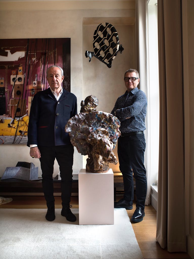
One firm which is making an art – and a business – of such adaptability is the Devonshire Street-based Bowler James Brindley.
Founded by Lucy Southall, Stephen Crawley and Ian Bayliss in 2014, the practice melds specialisms to deliver what it calls “a fresh paradigm based on collaboration and flexibility.” That involves embracing eccentricity and quirk to create individual interiors that engage their buildings and neighbourhoods in conversations, rather than treating spaces as blank canvases.
It’s an approach that has appealed to a realm of the capital’s most influential and successful residential developers – including Lodha, The Canary Wharf Group, Land Securities, Elysian and Mount Anvil – as well as to international hospitality clients including the W Hotel in Barcelona and Asia de Cuba at the Ritz Carlton in Abu Dhabi.
Here the BJB team walks us through four resi projects in London that illustrate the trend and approach, from a City tower aiming for some industrial character, to a 1960’s-inspired penthouse in Victoria where, in Crawley’s words, “Barbara Hulanicki meets Exile on Main Street/Mick Jagger combined with Wind Cries Mary era/Jimi Hendrix meets Twiggy”.

Designing for Place: Four case studies
Case Study One
One Crown Place: City slick X Hackney charm
- Developer: Alloy MTD
- Location: London, EC2
- Bowler James Brindley scope: 235 Residences, 1 Penthouse, residential entrance lobby & the adjacent “Sun Street hotel”

The vision of the architect KPF was to design a building which “combines imagination and efficiency.” To maximise the views of the residents, the resultant building produced a “prism-like silhouette and ensure the maximum amount of natural light reaches the streets below”.
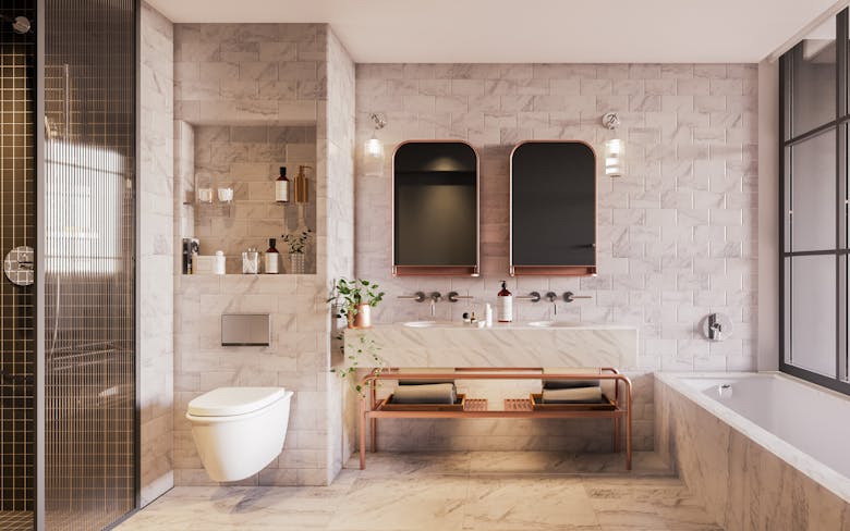
Stephen Crawley: “The buildings of the City and East London have provided rich inspiration for our design – we wanted to celebrate the eclectic aesthetic of both ‘City’ sleek combined with ‘Hackney’ industrial charm. Throughout One Crown Place, we have included an interesting mix of carefully curated textures and materials to complement the striking KPF architecture. The triangular angles on the building make for unusual, interesting and dynamic spaces with generous light, which works beautifully with the interiors. Oak herringbone floors are a nod to the elegant Georgian terraces which form part of the original site. Brickwork tiles are reminiscent of the area’s industrial heritage, yet when combined with marble take on an understated, opulent feel. Glass room dividers and cabinets paired with graphite metalwork are a subtle homage to the handsome warehouses of Shoreditch. Warm metallic hues are integral to the interiors, providing a harmonious link between inside and out.”


Case Study Two
Nova Penthouse: ‘Barbara Hulanicki meets Exile on Main Street/Mick Jagger combined with Wind Cries Mary era/Jimi Hendrix meets Twiggy’
- Developer: Land Securities
- Location: London, SW1W
- Bowler James Brindley scope: Duplex Penthouse Apartment
- Lead Interior Designer and Interior Architect for the Nova Building: FLINT
The Nova Building is a residential block of apartments in the heart of Land Securities’ 22 acre Victoria development with a rectilinear façade framed in bright primary coloured fins. The building was designed by Benson + Forsyth Architects, with FLINT providing interior design and interior architecture since 2011.

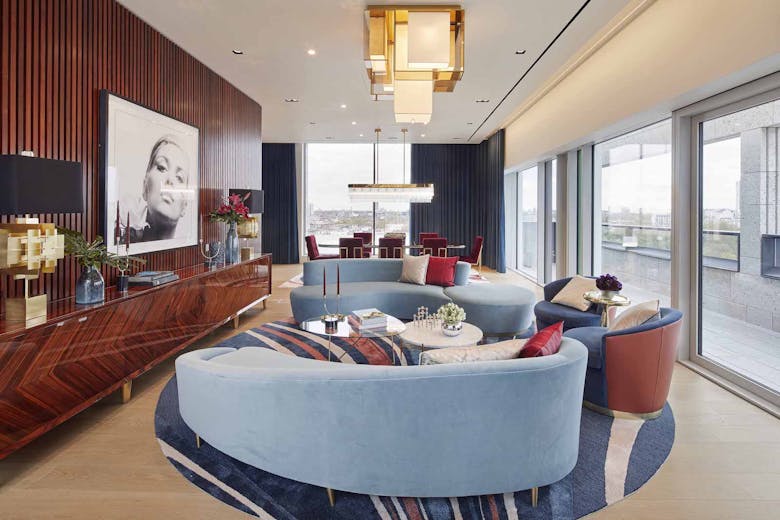
Stephen Crawley: “When Land Securities invited BJB to design the duplex Penthouse unit at their Nova development in Victoria we were given a brief ‘to create an interior which is memorable, spectacular and befitting of the quality of the Nova development.’ As a result we decided that the design would be personality driven, eclectic, with a clear point of view. We took inspiration from the architectural design of the building which was reminiscent of the work of European modernist architects working in the 1960s and 70s. We were also inspired by London artists, writers and musicians working at the same time and arrived on a character for the Penthouse – Barbara Hulanicki meets Exile on Main Street/ Mick Jagger combined with Wind Cries Mary era/ Jimi Hendrix meets Twiggy. These personalities challenged conventions, had new attitudes and were at the forefront of a new London based cultural revolution. The resultant design showcases polished rosewood, blue velvet, veneered walls, daring portraits, a cocktail bar, wraparound drapes and eclecticism in the true sense of the world. BJB also designed the roof terrace, a huge space with lounging, cooking and dining areas.”

Overall the finishes are overtly luxurious: plated brass detailing to edges, brass grilles to the front of the back bar, (hiding the fridge), a deep mahogany gloss to all the timber elements. To enhance the reflectivity, properly illuminating the back bar was important, it was designed with a bronze mirror and both integrated LED lighting as well as 60s inspired decorative and spherical wall lights. Polished black galaxy granite was applied to the front bar top, but softened with an upholstered armrest detail in tan leather, which makes it a bit more inviting and comfortable especially for a personal, residential bar.
On the bar front a perforated brass sheet wraps around the curved bar unit and is complemented by the curved backs of the Se collection bar stools.




Case Study Three
One Park Drive: Authentic lofts X Contemporary building
- Developer: Canary Wharf Group
- Location: London, E14
- Bowler James Brindley Scope: “Loft” apartments on levels 2-10 & level 32 “Sky Lofts”

One Park Drive is one of five new buildings on Wood Wharf forming a new district of the Canary Wharf estate. The building designed by Herzog De Meuron acts as an anchor of the west side of the district and can be viewed from all sides. The circular form of the building distinguishes it from its neighbours.
The unit mix is split into three residential typologies according to scale and height. The larger “loft” type units occupy the lower levels close to the water, smaller apartments make up most of the central section, and larger units on the upper floors.
Ian Bayliss: “It was our aim to bring to life the ‘Loft’ design introduced by the architect in their original concept for the building. We removed solid walls, added glass and sliding doors to capture the essence of an authentic loft found in traditionally industrial buildings and the flexibility of loft living. There are huge white walls and seamless grey resin floors. Services and air conditioning are hidden by a curving stained oak installation, inspired the circular plan of the building, as is the free standing circular shower.”


canarywharf.com/one-park-drive
Case Study Four
3 Lincoln Square: Historic culture X Minimalism
- Developer: Lodha Group
- Location: London, WC2
- Bowler James Brindley Scope: All 225 residences – Studios, 1, 2, & 3 bedroom & 2 Penthouses
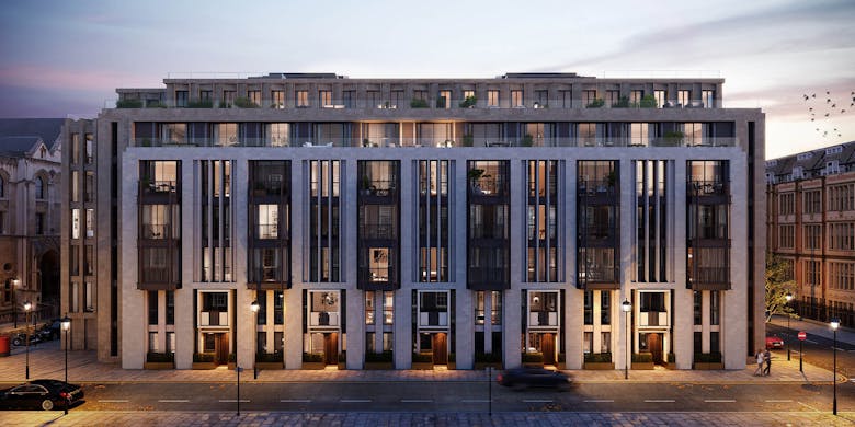
Lincoln Square is a development in Lincoln’s Inn Fields district of London and falling within the Strand Conversation Area. The building designed by PLP Architecture is neighbours with grand institutions such as the Royal Courts of Justice, the Royal College of Surgeons, the London School of Economics and of course the Inns of Court. PLP took inspiration from this compelling historical context and the design of this grand stone building “is reminiscent of neighbouring townhouses and each façade responds in scale and texture to its historical neighbour.”
Lucy Southall: “We were inspired by the approach of the architect. We created an understated, elegant scheme to provide a luxurious backdrop aimed at a resident likely to have lead a distinguished, cultured life. We studied the Library in Lincoln’s Inn, the Soane Museum and local well established local craft industries. Our aim was to produce a grounded, strong and intuitively safe residence with the ability to accommodate significant art or book collections but at the same time produce a space suitable for a minimal lifestyle. There are English stone floors, re-invented period details and eucalyptus veneered kitchens.”


www.lodhagroup.co.uk/lincoln-square-london
www.bowlerjamesbrindley.com / +44 (0) 203 0115880
In this article
Companies
Bowler James BrindleyMain image: Twiggy, printed on a chain curtain
