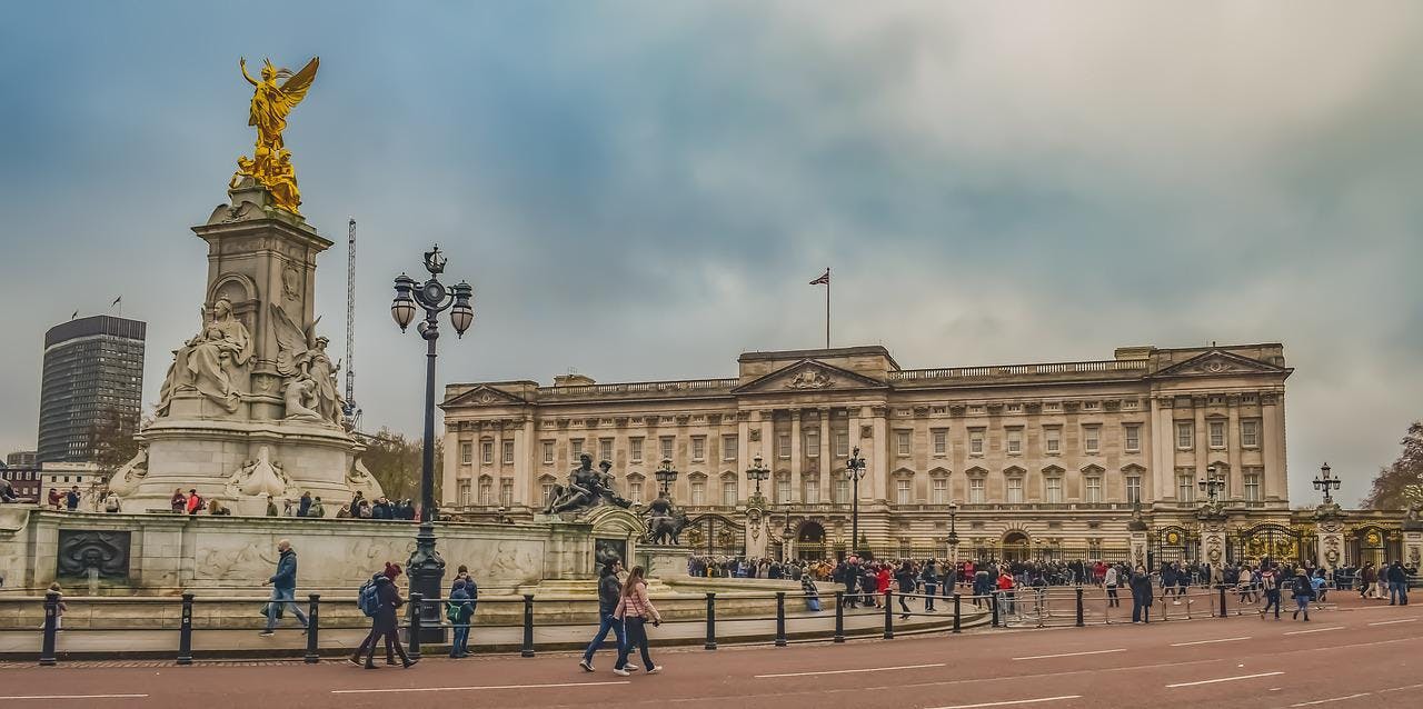
The façade of Buckingham Palace is so familiar that it’s easy to forget it is younger than Country Life. It also strikes John Goodall as dull. To mark the Jubilee, he asked six architects to suggest, in playful spirit, how it might be changed for the better.
In 1825, John Nash began converting what was then Buckingham House into what we know as Buckingham Palace. His creation forms the bulk of the building today, but is outwardly unrecognisable. Nash flanked the main range with low projecting wings terminating in pavilions, to create a three-sided court. This was entered via a central, free-standing triumphal arch.

Almost from the first, the project was mired in scandal
Almost from the first, the project was mired in scandal. George IV, his patron, endlessly changed the plans and even Nash himself disliked the low wings (soon elevated). Costs mounted to stupendous levels with astonishing speed and, after George IV’s death, Nash was dismissed amid public controversy. His replacement, Edward Blore, finished the work.
In the early 1840s, as the family of Queen Victoria and Prince Albert grew, there was a demand to expand the palace. Blore drew up plans for an east wing to close in the open courtyard, which meant Nash’s triumphal arch had to be relocated. It now stands at— and has given its name to—Marble Arch.
Blore’s new wing was 25 window bays wide, articulated to each end by a pavilion and in the centre by a gatehouse. Brighton Pavilion was sold to raise money for the work and sup- plied many of its fittings. It was constructed from 1846 by Thomas Cubitt, who had also built Osborne House on the Isle of Wight.
After the death of Queen Victoria in 1901, a public fund was established to reconfigure the setting of the palace as a memorial to her (Country Life, May 5, 2005).
An open competition, won by Aston Webb, widened and re-orientated the Mall to create the ceremonial approach to the palace we know today. This was entered by a new triumphal arch – Admiralty Arch – from Trafalgar Square. Incredibly, before this change, there was no axial approach to the palace. Webb also created the palace forecourt and circle, with Thomas Brock’s monument surmounted by a gilded image of Victory. When all the work was completed between 1903 and 1911, however, there was still £50,000 in the fund.
In the course of three months over the autumn of 1913, 800 men working shifts by day and night completed the whole task
Webb, therefore, was commissioned to re-front the palace, too. He worked within extraordinary constraints. The palace could only be refaced, so all the window openings and levels of Blore’s building had to be preserved. In addition, the work had to take place when the Royal Family was away at Balmoral, so, in the course of three months over the autumn of 1913, 800 men working shifts by day and night completed the whole task. The Portland stone was delivered to the site in relays as required.
In technical and organisational terms, Webb’s achievement in creating the façade was extraordinary. There are some notable authorities, including the architectural critic Ian Nairn who have hailed it as an aesthetic success. To my eyes, however, it looks dull. We have a monumental exercise in Edwardian Baroque – a style synonymous with playful ebullience – imprisoned by the Victorian volume behind it. Could it be improved upon?
Francis Terry, Francis Terry and Associates
“I am unusual within my profession because I actually like Buckingham Palace, but if I was going to change it, this is what I would do:
1) It has a dull silhouette that needs to be enlivened
2) The central portico would benefit from being widened
3) I would replace the small windows at the capital level with stone swags
4) The courtyard could do with a few trees framing the entrance.
“Apart from these small tweaks, the rest should stay as it is.”

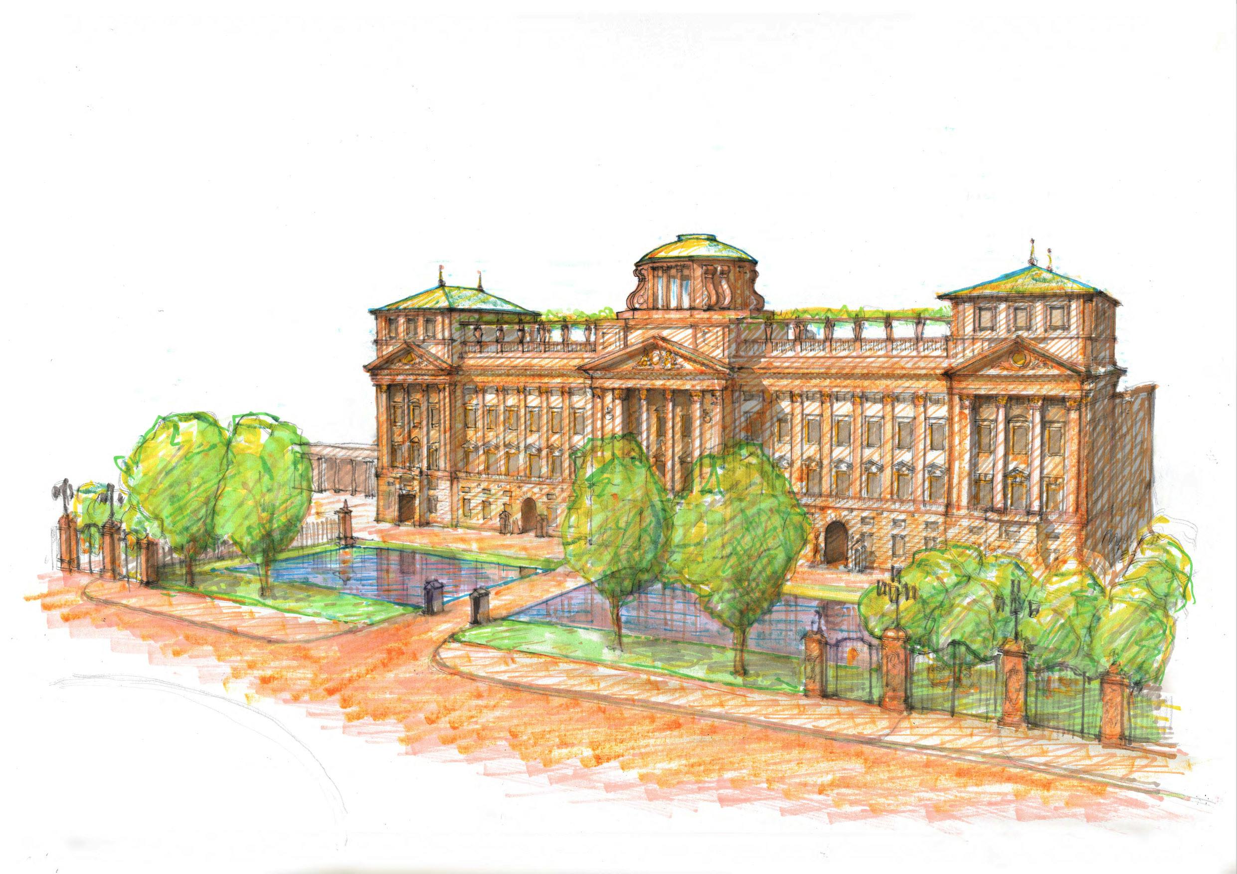
Mark Hoare, Hoare Ridge & Morris
“The palace needs some well-judged gilding! (Think Chatsworth.) It also needs more vertical emphasis to counteract the long, low front, so here come rooftop pavilions with pergolas linking to a central dome on the axis of the Mall. The new palace now has a roof garden with beehives and
a sheltered space for outdoor entertaining and concerts (very Covid-safe!).
“At street level, the central railings and sterile expanse of forecourt have given way to a moat and orchard. The palace breathes a sigh of relief, more open to the city and the surrounding parks. Plane trees have risen along the pavement and fruit trees run behind some of the now redundant gates. One has done one’s bit in greening the city.”

Ross Sharpe, Yiangou
“The present front of Buckingham Palace is huge, bleak and slab like. I remember my first visit as a child, when it seemed more like a civic building from a totalitarian state than a place where kings and queens, princes and princesses should be.
“The proposals for the revised palace represent a scaling back of height and gravitas, to a form that although civic, has a more interesting rhythm and approach- ability. It is Nicholas Hawksmoor, William Kent and Charles Barry in inspiration, and the lower arcades provide views into the courtyard behind, which breaks down the barrier that the present structure seeks to impose.
“London’s skylines are a wonder and here is an attempt to add picturesqueness, with a chance for a garden with viewing pavilions, perhaps looking forward to
a time when the public may enjoy that opportunity more. And, prominent on the balustrade, stand statues of worthy figures that no generation can deny.”

Natasha Brown, Giles Quarme Architects
“Buckingham Waterworld. What if Nature does what it always does? If sea level rose by a yard, due to climate change, the Thames flooding of central London would occur. Wellington Arch would form the Watergate for the palace.
“The Queen’s rowing barge, Gloriana, could be an excellent water taxi, and Thames barges would provide zero- carbon deliveries. Duchy of Cornwall kelp forests could provide roof insula- tion with a native tree-covered roof garden, assisting carbon offset. What of Aston Webb’s façade? It would be lifted beyond current recognition with the Arch and reflections in the water. Exercising the horses and corgis might be a challenge…”

Robert Kerr and Robert Cox, Adam Architecture
“A client once said that although they liked Buckingham Palace as a model, they thought it could be improved with a dome. On recounting this to the Architectural Editor of Country Life, he politely asked: ‘Which elevation?’ Given the chance to explore improvements to the East Elevation, the dome provides this opportunity to demonstrate how right clients can be.
“To either side of this new strong focal point along The Mall, wings have been brought out to the line of the railings, creating a more powerful and positive front to the Palace and the public. The repetitive rhythm that currently runs along the face of the façade has been simplified and replaced with crisp, refined Classical detailing. The porticos have been improved by creating more depth and elegance.
“The whole composition hopefully creates a sense of powerful embrace that gives Buckingham Palace the aura, the grandeur and the confident splendour
it deserves.”

Ptolemy Dean, Ptolemy Dean Architects
“I would want to open up the façade to give a view into Nash’s original palace forecourt. It’s a magnificent space and one that many visitors don’t realise exists.
“As I drew this view, with the central section of the façade opened out, I realised that I was remaking those lovely open colonnades at Somerset House and also the BBC building at Bush House, so this does have a good London pedigree.”

Feature republished courtesy of Country Life magazine; the Platinum Jubilee issue is out now
In this article
Topics
Headline PostMain image: Francis Terry's redesign of Buckingham Palace 2022 for Country Life Magazine, 25th May 2022 issue (Queen's Diamond Jubilee issue)


