infography
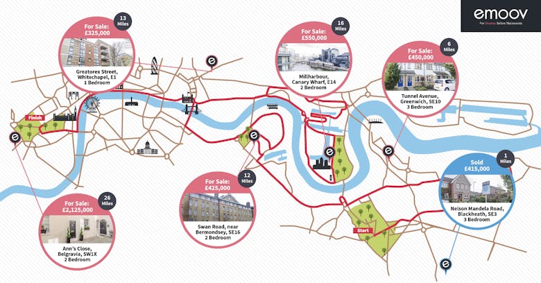
INFOGRAPHIC: The London Property Marathon
Canny online outfit emoov has repurposed the route of this weekend's London Marathon to create a pretty interesting tour of the capital's property market.

INFOGRAPHIC: The richest real estate tycoons in emerging markets
The 2015 Forbes Billionaires List, which ranks those around the world earning more than $US 1 billion by their net worth, included a total of 157 real estate tycoons, 96 of whom were based in the Asia-Pacific…

Infographic: How estate agents turned onto Twitter
Eight years ago, the idea of distilling all that wit and wisdom down into 140 characters seemed nigh on impossible.

Infographic: OnTheMarket Vs Rightmove Vs Zoopla
The Paul Weller-inspired stickers are up in windows across the land as OnTheMarket-day looms on Monday. But how does the new portal stock up against the incumbent duopoly?

Infographic: Knight Frank’s Price Map of Prime London
High-end estate agency Knight Frank has drawn up a map of prime central and prime outer London, complete with price performance stats for each of its office's sales and rentals departments.

INFOGRAPHIC: How strong is Agents’ Mutual in your postcode?
Following the news that OnTheMarket.
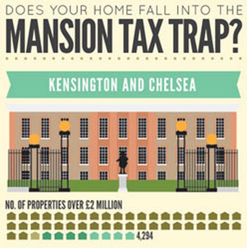
INFOGRAPHIC: ‘The Mansion Tax Trap’
The peeps over at Property Division have had a bash at an ambitious Mansion Tax visualisation, showing the extent to which each London borough would be affected by Labour's proposed new levy.

Infographic: London’s house price boom by borough
There aren't any new stats here, just a pretty way of looking at them.

Infographic: The ‘Real Life’ UK Monopoly Board
We're not sure if Hasbro is ok with this or not, but an online agency has had a pop at reimagining the Monopoly board with UK towns instead of London streets, and current average property prices instead…

Infographic: How long does it take to secure a buyer in London?
Following on from this report on where the UK's fastest-selling property hotspots are, Rightmove has made the London data into a snazzy infographic.

Infographic illustrates London’s property market schism
We've written a lot about London property prices going up and up like the Serpentine's endless staircase, but it's not all rise across Greater London.

Infographic: Rightmove House Price Index
Who doesn't love a good infographic? Rightmove definitely does. The portal's gone to town with its August House Price Index, breaking it down into many blue and green pictures: